Color
We are fresh, innovative and welcoming, and our color palette supports that. The Terumo BCT green is the predominant color in all cases. It is by far our most distinguishing feature and an essential part of our brand identity. The Terumo BCT orange plays that all-important role of second in command, along with our dark gray and light gray shades.
Hierarchy
Brand colors can and should be used to convey the importance of any given subject or object. For example—when the user is being asked to take action (read more, click here, view video), the Terumo BCT green should be used in the design element. Secondary colors should be used only occasionally as highlight colors.
Connotation
Be cautious when selecting colors for our global audience. While red might convey urgency or concern in one culture, it may mean good luck and success in another. Color speaks its own international language and we should ensure that our message is clear and consistent.
Less is more
A clean aesthetic, ample use of white space and judicious use of color are all ideals that will serve you well when designing for Terumo BCT. Our Terumo BCT green and orange are bold, intense colors. Avoid using them with too much enthusiasm. Instead, use color to inform the user experience rather than distract from it.

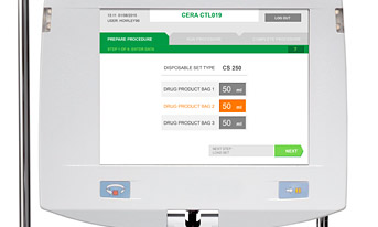
Examples
Review these examples to gain an understanding of excellent brand color utilization.


Swatches
Stay true
Always use the true value of the Terumo BCT brand colors. We’ve shown lighter and darker tints here, as well. However those tints should be avoided except when needed within data visualization. Unique applications might call for additional color support.
Click color value to copy to your clipboard